Brand identity
Capizzi Servizi
Visual identity for a drain services and maintenance company
A brand designed to express the team's quick response and the trust a family-run business builds in its local community.
Context
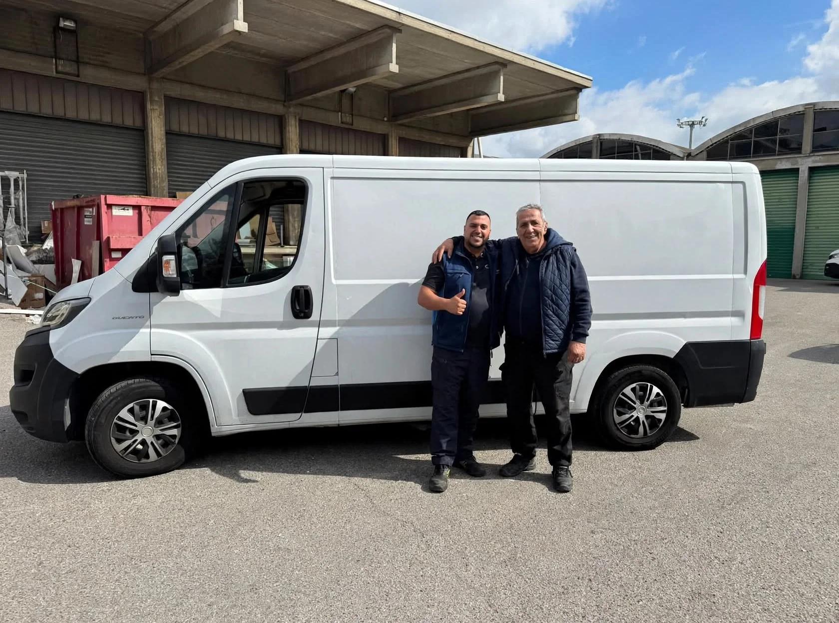
A trade passed down through the family.
Capizzi Servizi grew out of the founder's experience in construction. In 2020 he brought those skills to drain services. That family story shaped an identity rooted in a practical approach to work, quick response and clear communication.
Goals
An identity that reflects the team at work.
- 01
Make the brand recognisable
Define a mark and a palette that distinguish Capizzi Servizi in the drain services sector.
- 02
Convey speed and expertise
Reflect the team's quick response through a dynamic mark and high-contrast colours.
- 03
Keep the human connection visible
Bring out the family story and the straightforward tone of a team that shows up, explains the problem and helps solve it.
Visual system
From research to logo and workwear.

Water, pipes and hands at work shape the visual research.
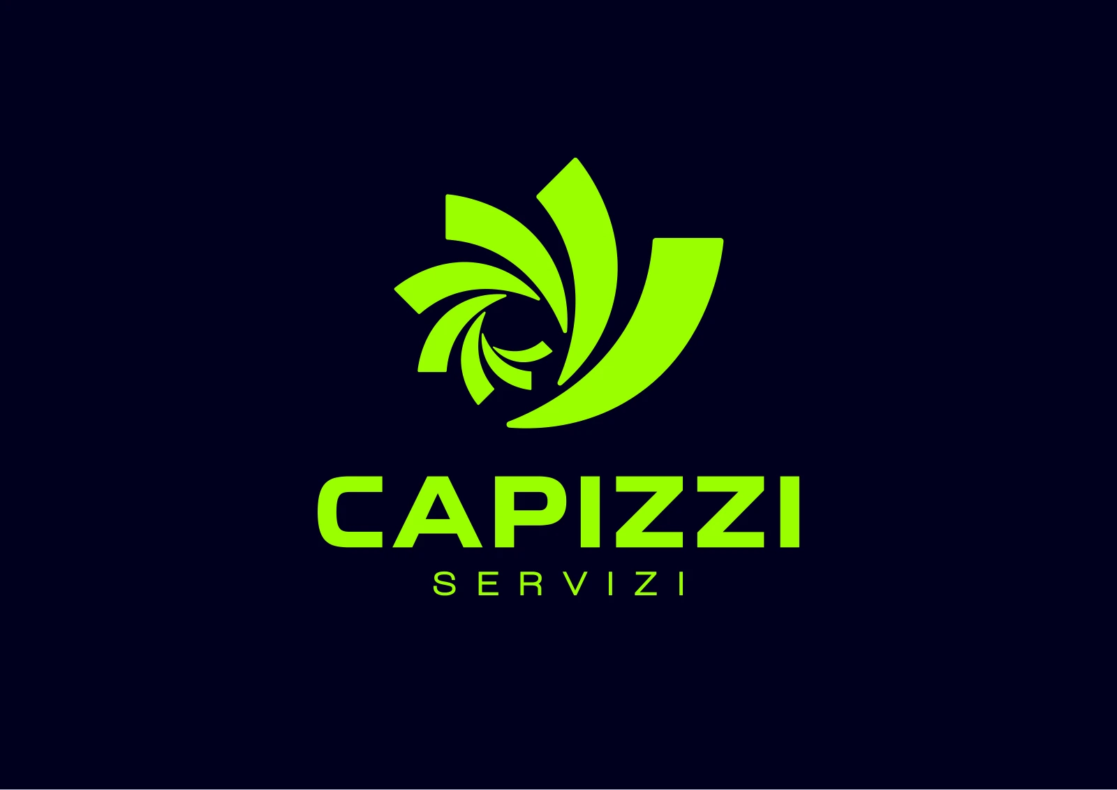
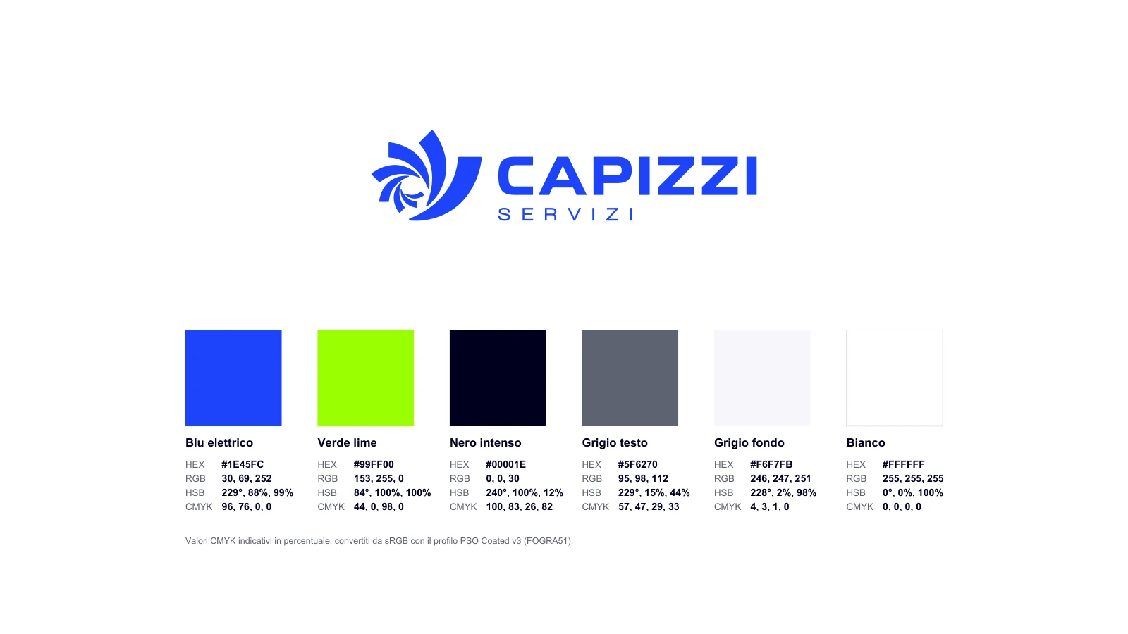
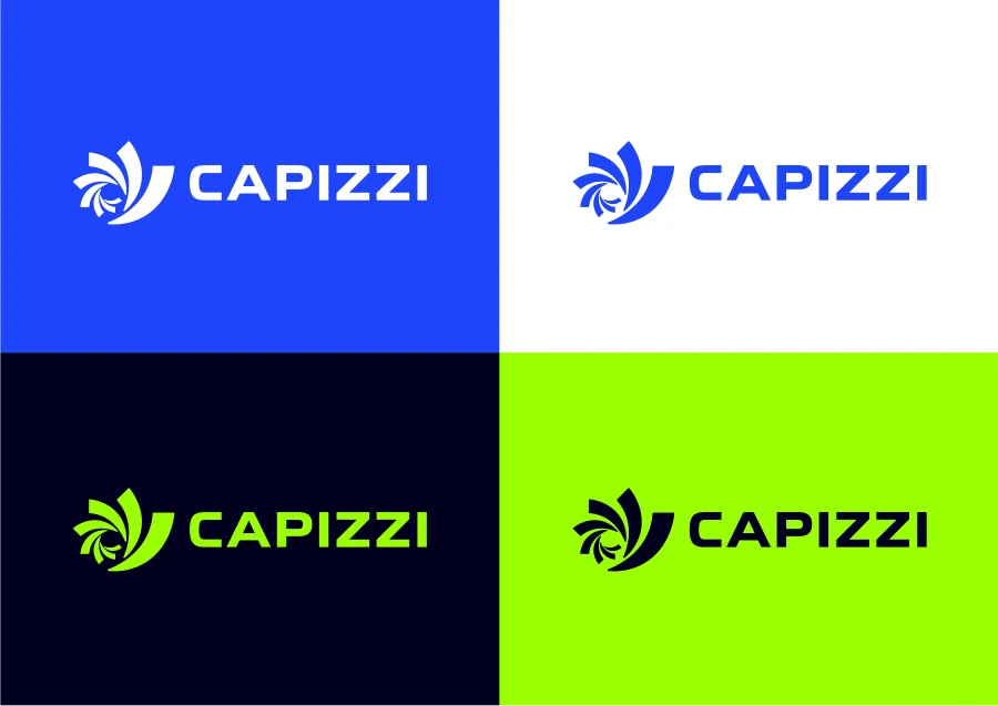
A swirling symbol evokes flowing water and a quick response.
Electric blue and lime green energise the brand, with deep black providing contrast.
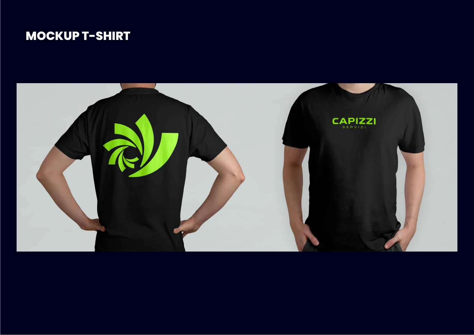
The mockup shows the logo on the front and back of a work T-shirt.
Final result
A dynamic mark for a dependable service.
The swirling mark evokes the movement of water. Electric blue and lime green make the brand recognisable across the website and workwear.