Brand identity
Lucrezia Curto
Visual identity for an accounting studio
A visual system designed to communicate precision, empathy and authority, turning the studio's character into a recognisable identity.

Context
Professional rigour, with a more human presence.
The project began with the need for a clearer, more distinctive studio presence. The research combined the institutional language of consulting with a warmer tone, expressing technical precision and genuine attention to people.
Goals
A strong visual direction.
- 01
Make the studio recognisable
Build an immediate, orderly visual system that is easy to associate with Lucrezia Curto.
- 02
Communicate trust and expertise
Align logo, palette and visual tone into a professional, consistent presence.
- 03
Work online and offline
Design a flexible identity tested across digital touchpoints and physical materials.
Visual system
From positioning to application.

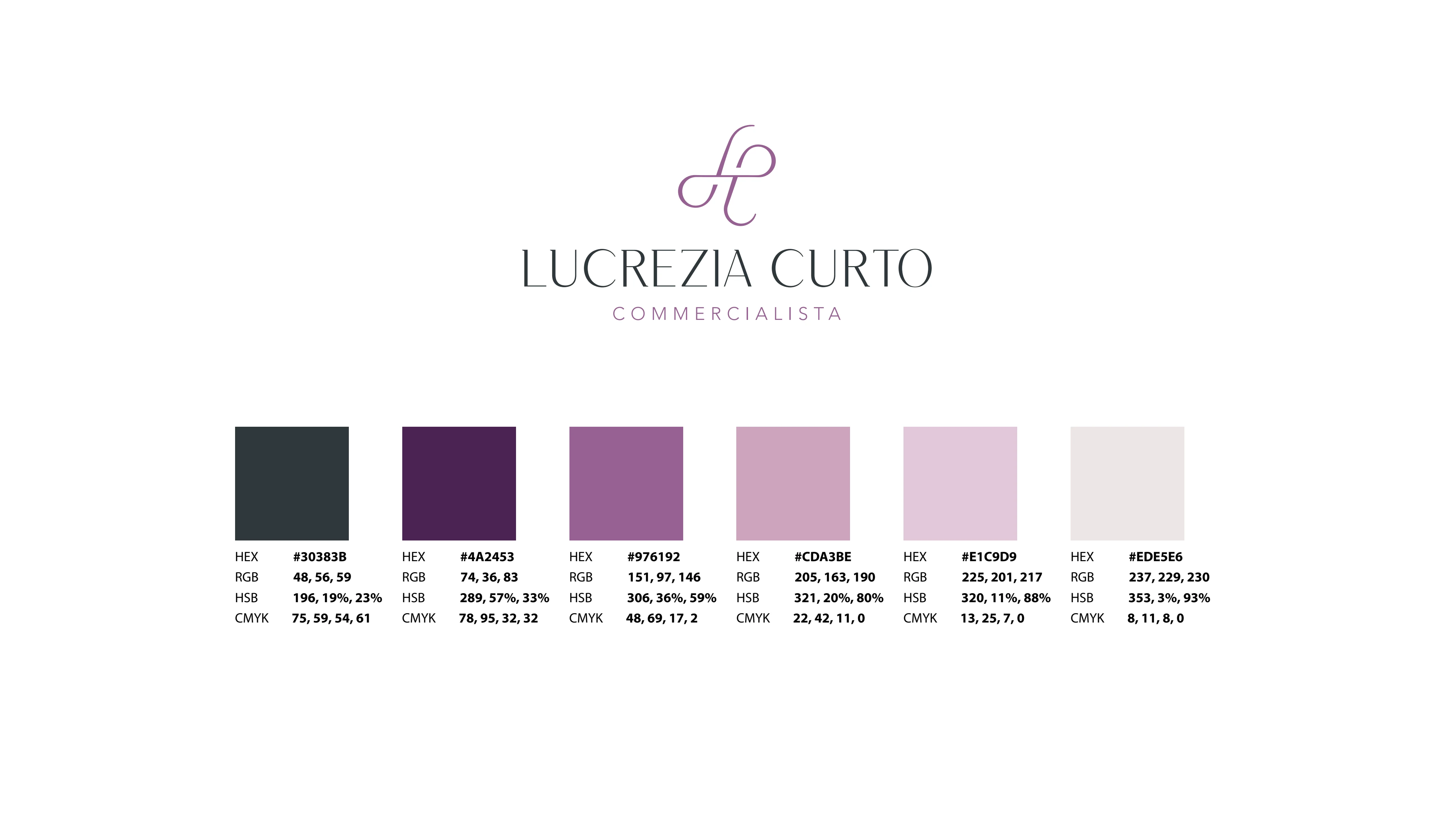
A contemporary, elegant and distinctive direction.

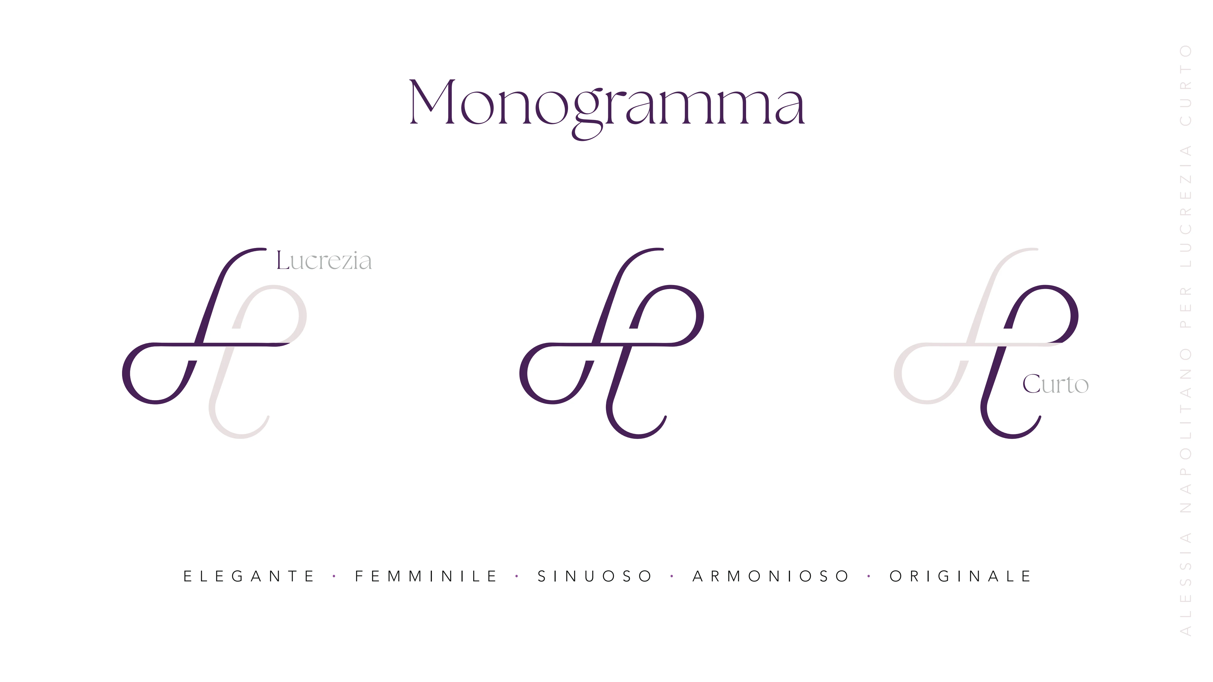
A flowing monogram built from the initials.
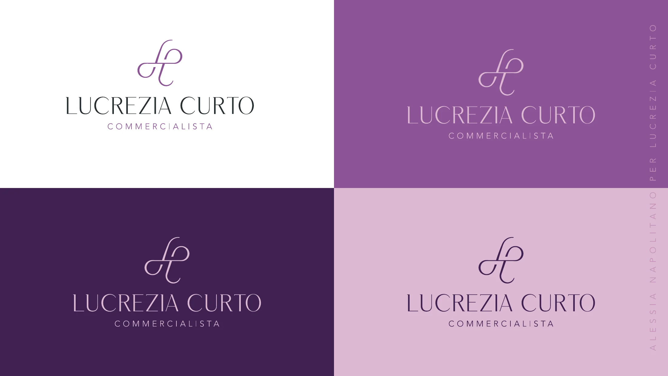
Logo, colour and pattern designed to work together.
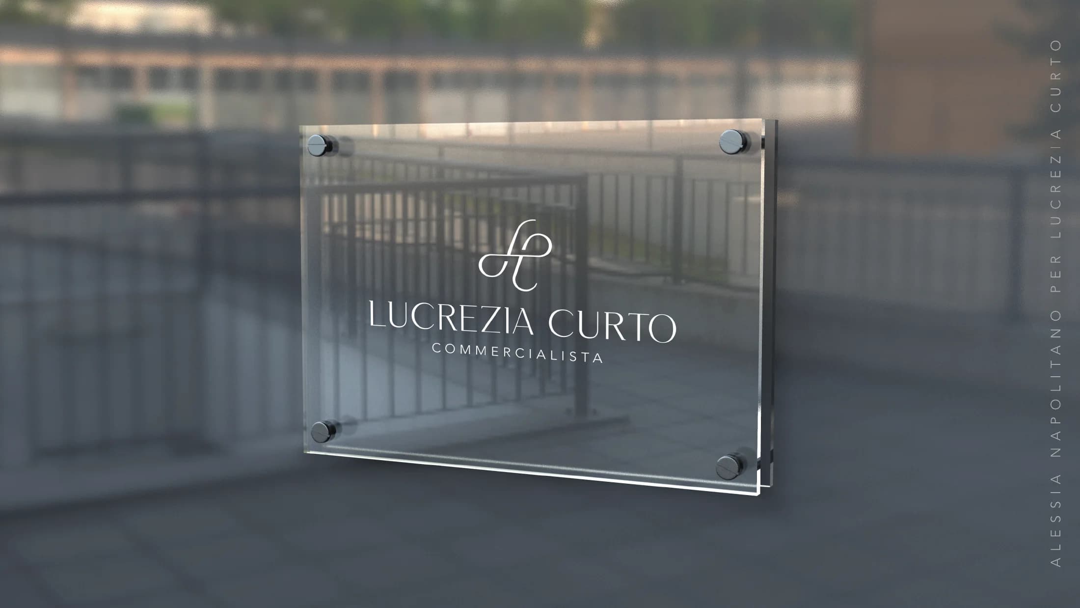
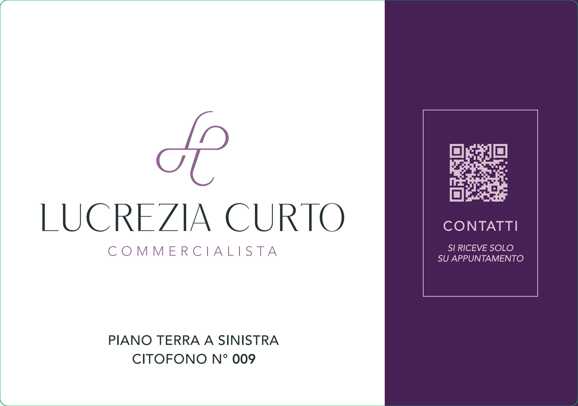
The identity comes to life in the physical space.
Final result
An elegant, professional and coherent identity.
Purple becomes the thread running through a distinctive, flexible system. Monogram, typography, palette and applications create a presence that works with equal clarity online and offline.