Logo design
PizzaOS
The shape of a pizza becomes the mark of a digital platform for pizzerias.
Open the presentation (PDF, Italian)
From pizza to pictogram
The concentric circles take their cue from the shape of a pizza and also evoke a doughnut chart and a target. This geometry gives PizzaOS a mark that connects pizza with data and goals.
How the mark is built
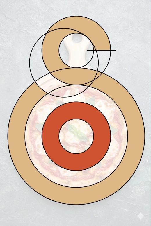
Geometry
Circles and arcs create a balanced mark that stays legible at small sizes.

Analysis
The rings echo dashboard charts and the measurement of performance.

Focus
The centre of the mark suggests a target and the precision needed to reach a goal.
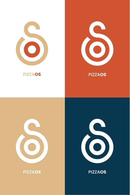
Recognition
The silhouette remains recognisable in colour and in white across the palette.
The palette
BurlyWood
#DDB785Warmth and stability
Tomato
#CF5430Energy and attention
Dark Blue
#0A384FTechnology and trust
The mark in use
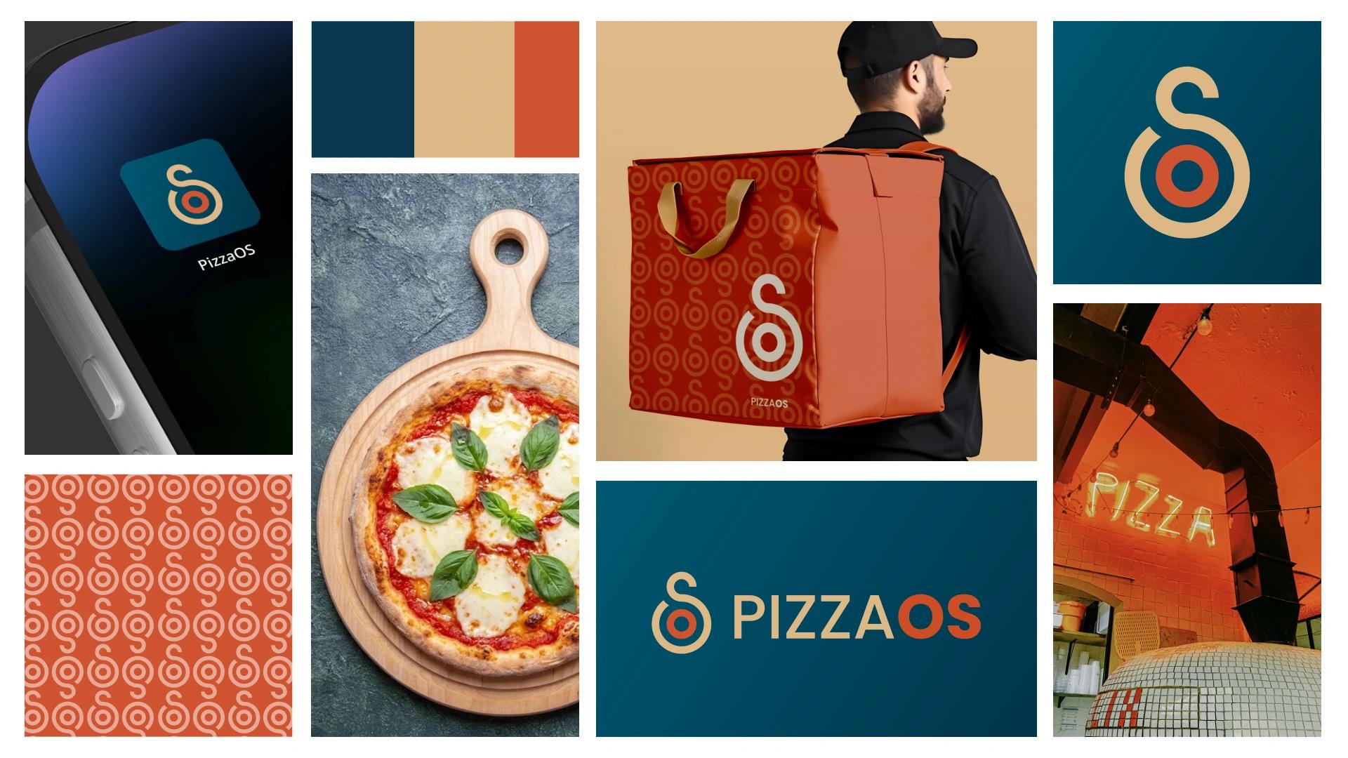
The moodboard pairs the mark with mockups of the app, a delivery bag and signage. The pictogram becomes both an app icon and a repeating pattern.